ggplot2 in Action - Part 1
This series of posts show how to use ggplot2 in my daily exercises. The posts contain detail tricks and tips to plot nice graphs with ggplots. The structure of the post should be as followed,
- Firstly, the main object and final plot are shown.
- How to do data preparation and manipulation.
- How to match the data to the axes together with their summary statistics
- Some tweaks on the scales, colors, legends, …
How to plot histogram and density in the same plot
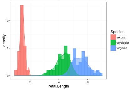
I will use the simple Iris data for this example. Here is the histogram and density of Petal.Length for Species (setosa, versicolor, virginica)

Detail explanation
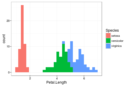
Well, let take the data and obtain the histogram first. Remember that we want to group the data according to Species
ggplot(iris, aes(x=Petal.Length, fill = Species)) +
        geom_histogram(bins = 30) +
theme_bw() 
For the area overlap between versicolor and virginica, we need to change their position so that they are not stack over the other.
geom_histogram(position = "identity", alpha = 0.8, bins = 30)Now we try to add the density plot
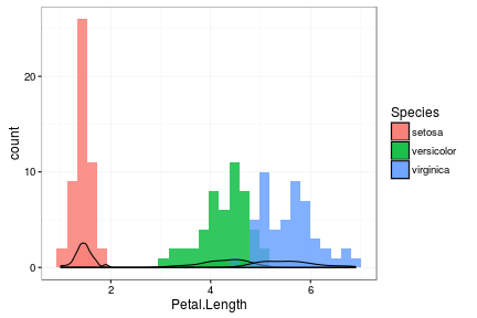
ggplot(iris, aes(x=Petal.Length, fill = Species)) +
        geom_histogram(position = "identity", alpha = 0.8, bins = 30) +
        geom_density(position = "identity", alpha = 0.5) +
theme_bw() 
Upsss, it seems that ggplot could not match the y scale of histogram and density together. In order to scale density up to histogram count or scale histogram count down to density, we use “..density..” or “..count..” for aes(y)
ggplot(iris, aes(x=Petal.Length,..density.., fill = Species, colour = Species)) +
        geom_histogram(position = "identity", alpha = 0.8, bins = 30) +
        geom_density(position = "identity", alpha = 0.5)  +
theme_bw() 
Well, that solves the problem! It took me a while to figure out.
